

Zine Camp IV
More info coming... more
More info coming... more

Limited edition printed for TENT Rotterdam, during the exhibition Spending Quality Time With My Quantified Self curated by Niekolaas Johannes Lekkerkerk and Jesse van Oosten.... more

"Greetings from the Invisible Borderlands” is a series of messages that experiment with analog steganography, the art of concealing information within plain sight, for contemporary online surveilled mediascapes.... more
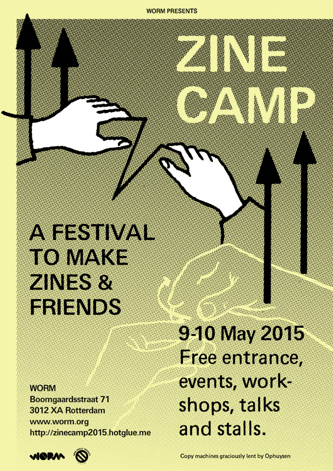
Eyesberg played a double function again organising and designing the identity for Zine Camp at WORM this year. We made the posters, flyers, website and navigational signage. In the same spirit as Zine Camp 2014, the aim was to make zines together, but also to provide a space to socialize and collaborate in an attempt to discover and foster a growing community of zine-makers in the NL and abroad.... more
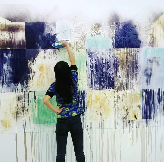
An interactive poster printed in 3 different types of invisible inks to ensure better protection. Steganography is the art and science of hiding messages in plain sight and invisible inks are one of the longest traditions of steganography spanning 2000 years of history. In order to uncover the whole message, visitors of the show were invited to activate the poster with 3 different kinds of activation methods, discovering secret writing and it's tactical and strategical use throughout history.... more

Working under Eyesberg (Tim Braakman and myself) we organised and designed the identity of Zine Camp, a DIY festival with open workspaces connecting like-minded zinesters and newbies from Rotterdam to national/international zinesters and newbies. The aim was to make zines together, but also to provide a space and place to socialize and collaborate in an attempt to discover and foster a growing community of zine-makers in the NL. In collaboration with WORM, PrintRoom and Rekult.... more

Exhibition identity and typeface design based on Platform for Chaos typeface developed in 2007. I also made a zine called Tour de Squat that was a part of the exhibition about the story behind how and why I made this typeface.... more

An illustrative typeface developed using squatted and abandoned buildings in Rotterdam as the components of each letter. Buildings include de Fabriek, Locus 010, Poortgebouw... more

A book of portraits of five close friends and family. Affection grows through time spent with others; it is tactile, emotional and intimate. The book is created... more

Exhibition design for 'Fields of [Inter]action', part of the exhibition ‘A better world, Another power’ in the Netherlands Architecture Institute (NAi) Rotterdam, at the Architecture Biennale...... more